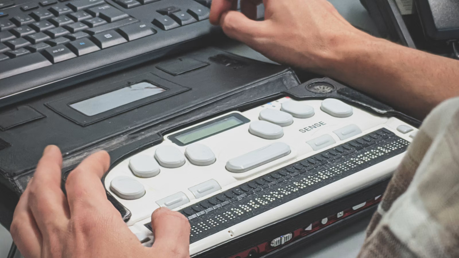
Accessibility tends to get treated as an afterthought, or something only large companies need to worry about because of legal exposure. In practice, it’s a smaller list of fixable things than people expect and it makes your site genuinely easier to use for a lot more visitors than you might think, not just people using screen readers.
1. Color contrast that’s actually readable
Light grey text on a white background might look clean in a design file, but it’s genuinely hard to read for a large share of visitors not just people with low vision. We check contrast ratios against accessibility standards as a normal part of design review, not an extra step.
2. Alt text on every meaningful image
This comes up in SEO too, but the original reason alt text exists is accessibility it’s what a screen reader announces instead of an image. A product photo, a chart, a logo that conveys information all need a short, accurate description. Purely decorative images can be marked to be skipped entirely.
3. A site that works without a mouse
Some visitors navigate entirely by keyboard tabbing through links, buttons, and form fields. If focus states aren’t visible, or if tabbing through a page jumps somewhere unexpected, that’s a real barrier. This is also one of the easier things to test: just try using your own site with the mouse put away.
4. Forms with real labels
A placeholder inside a field is not the same as a label it disappears the moment someone starts typing, and screen readers don’t always announce it the same way. Every form field needs an actual, persistent label connected to it.
5. Video and audio with captions or transcripts
If a site has video content, captions matter for more than accessibility plenty of people watch with sound off anyway. Where that’s not feasible, even a text transcript underneath helps both accessibility and search visibility.
Why this is worth doing regardless of legal risk
Accessibility lawsuits are a real thing for larger sites, but we’d recommend this list regardless a more accessible site is also just a better-built one. Good contrast, working keyboard navigation, and real form labels tend to be signs of a site built carefully in general.
If you want an honest read on where your site stands, that’s a good thing to bring up on a discovery call.
“Accessibility isn’t a separate project it’s what a carefully built site looks like anyway.”